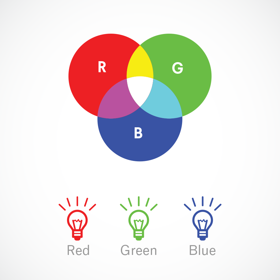
RGB (Red, Green and Blue) is the color space for digital images. Use the RGB color mode if your design is supposed to be displayed on any kind of screen.
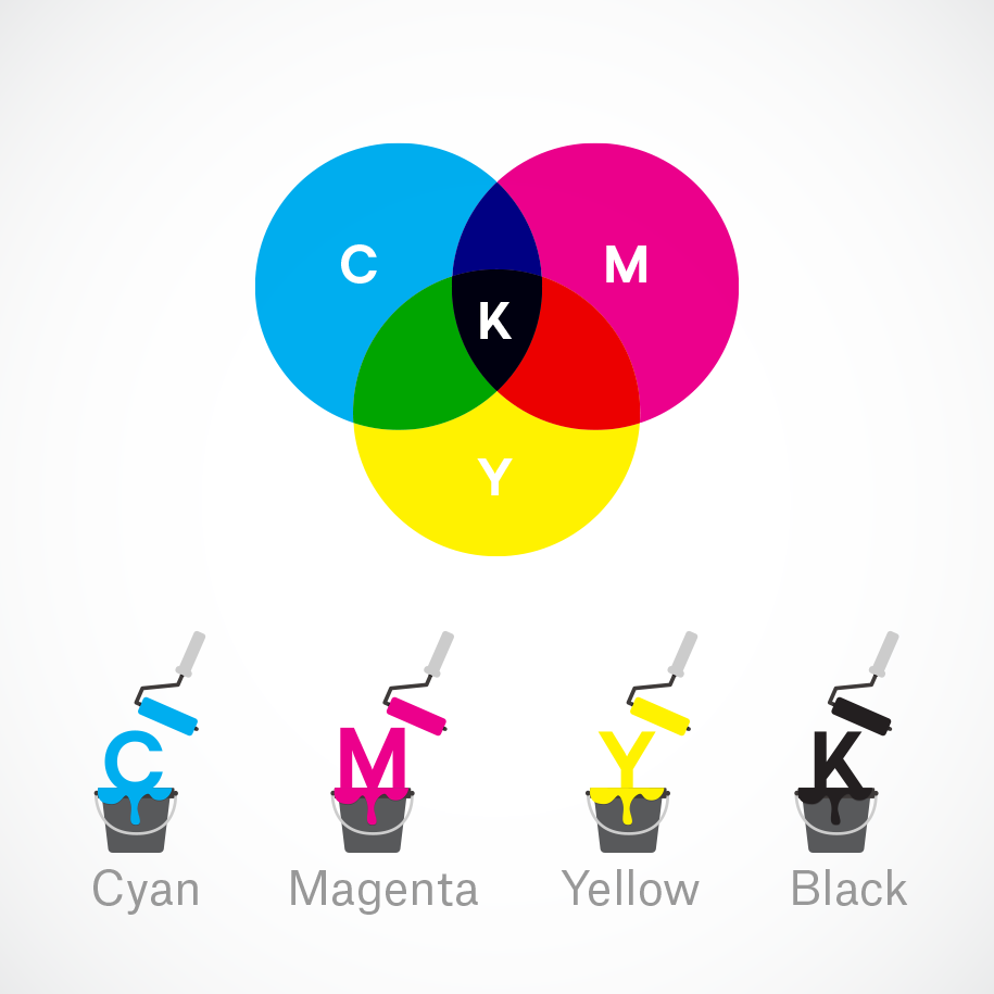
CMYK (Cyan, Magenta, Yellow, Key/Black) is the color space for printed materials.
1. Emphasis
Like writing without an outline or building without a blueprint, if you start your composition without a clear idea of what you’re trying to communicate, your design will not succeed.
2. Balance and alignment
every element you place on a page has a weight. The weight can come from color, size, or texture. Just like you wouldn’t put all your furniture in one corner of a room, you can’t crowd all your heavy elements in one area of your composition. Without balance, your audience will feel as if their eye is sliding off the page.
3. Contrast
Contrast is what people mean when they say a design “pops.” It comes away from the page and sticks in your memory. Contrast creates space and difference between elements in your design. Your background needs to be significantly different from the color of your elements so they work harmoniously together and are readable.
How to desing cover
the process step by step:
